4 Conversion Optimisation Case Studies To Learn From
Most marketers stress about traffic all the time. Getting to page 1 of search engines and driving traffic from Facebook ads is what most people are obsessed about. However, all of this is of no use if that traffic doesn’t convert.
Conversion rate optimization (CRO) consists of optimizing landing pages, app screens, ads/messaging and more to increase your conversion rate. It emphasizes various key performance indicators (KPIs) like improving the number of customers, registrations, downloads, etc.
Based on the KPIs you want to improve, CRO involves building multiple hypotheses and testing the same. A high conversion rate means a better return on investment (ROI).
In addition to improving your ROI, optimisation helps to defend against the limited attention span of your average visitor by giving them what they want before they tire of looking for it and move on.
It’s essential to understand that optimization should focus on getting the right customers for your business and help it grow.
Below are four individual case studies highlighting different approaches to conversion optimisation followed by different companies and what they learned from it.
#1 Basecamp/Highrise
Previously known as 37 Signals, Basecamp is a web application development company based in Chicago. They have been operating since 1999 and have therefore witnessed the evolution of the internet and e-commerce.
Objective – The company wanted to try out a new idea they had for the design of their website. Going against industry advice, Basecamp wanted to replace the current landing page of their product High Rise with a version that was more minimalist; reducing the number of elements and positioning those that remained around the face of a photo of a smiling woman. They wanted to see if radically altering their landing page would impact their conversion rate.
Test – They ran an A/B analysis of the new page versus the old page in order to test which version was most effective.
Result- To the surprise of all onlookers they found that their new landing page increased conversions by a whopping 102.5%; it essentially doubled their sales by adding the photo of a smiling person to their landing page.
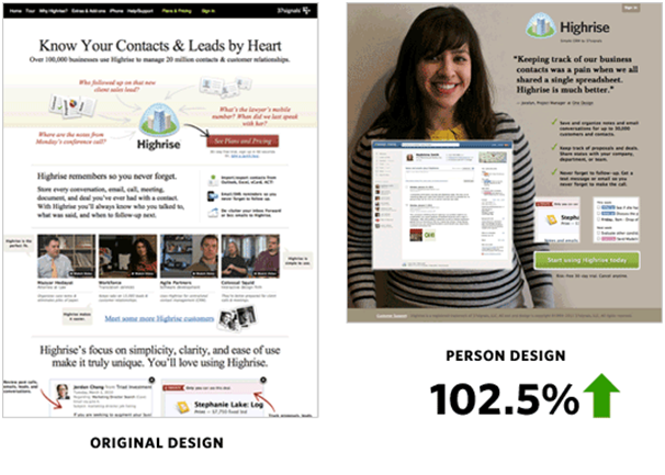
Takeaway –Using images of real people helps in building trust and gain credibility. This subsequently affects the buying decision of a potential customer.
#2 Intuit
The team at Intuit is probably best known for developing Quicken; an industry renowned software package for managing personal finances, as well as Quickbooks which serves a similar function for businesses.
Objective – Intuit faced a major problem of negative feedback on social media. It resulted from inadequate information provided to consumers who selected software packages unsuitable for their needs. The company needed a way of intervening before the customer committed to a purchase, in order to make sure that they were buying the right product for their needs.
Test – Intuit decided to tackle the problem by introducing a proactive chat into the ordering process. Early in the buying process, a customer would be presented with both a ‘Review Your Order’ button and a ‘Product Comparison’ button. These pages contained a proactive chat box so customers could discuss their choices with the company and wouldn’t commit until they were sure they were receiving the right package.
Result- The results were a staggering 211% increase in conversions following the implementation of the chat boxes.
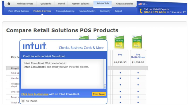
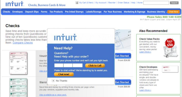
Takeaway –This case demonstrates how crucial an effective tech support is. It’s not about how much money you throw at your tech support department rather it is where you deploy your technical assistance and how easy it is for the customer to access it when they need it.
Want to know more about how to acquire new customers? We’ve compiled 10 B2B and B2C customer acquisition strategies in a free book. Get your copy today!

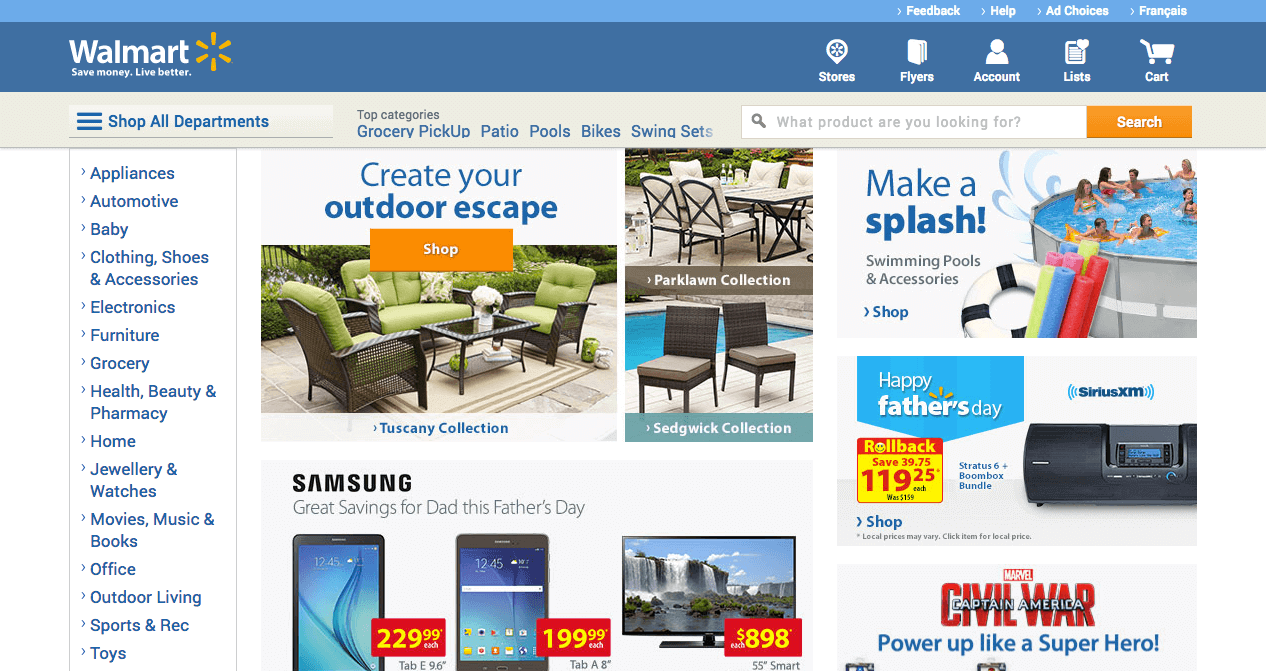
#3 Walmart Canada
Walmart is a true titan of retail and is one of the big American brands to have firmly established itself in the days before the internet was widely available. However, as with many retail giants in their position, the Canada division of Walmart was slow to react to the changes in consumer behaviour that resulted from the internet revolution. Walmart’s continued ignorance towards the opportunities presented by both the internet and mobile markets soon became noticeable especially when one compared Walmart’s performance to similar businesses.
Objective – One of the biggest issues Walmart had was that its website was clunky and awkward to use for many users and was virtually not navigable on a mobile device. Even on the desktop version, poor programming practices rendered the site needlessly slow to interact with, and they made no attempt to disguise this fact.
Test – Walmart, therefore, set out to design a website that took advantage of new features in HTML that allowed for a web page that could rearrange itself according to the device it was being browsed on.
Result – After implementing these changes fully, Walmart saw a surge in sales made online through mobile devices, with an overall rate of increase of nearly 100% while overall conversion rose by 20%.
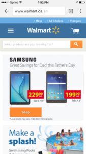
Walmart.ca Today
Takeaway –
- Having a fully responsive design of the website is essential to convert visitors into customers.
- Removing unnecessary buttons and other elements on the web page which could be considered ‘confusing’ helps in improving the conversion rate.
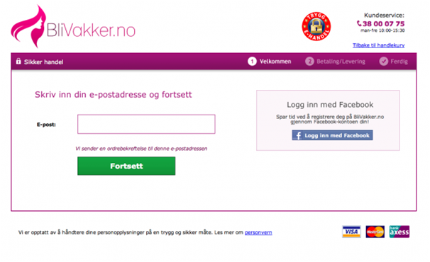
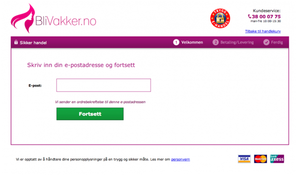
#4 BliVakker.no
BliVakker is a Norwegian online business and is one of the most successful and recognizable online brands in the country.
Objective – BliVakker set out to streamline their checkout process. At that time, eBay and Amazon were the two big names in online shopping. Partly as a reaction to Amazon’s success, eBay added a ‘buy it now’ button in many of its online auctions, allowing items to be purchased outright without the need for a bidding war. BliVakker heard of the positive results this was leading to and wanted to try something similar.
Test – The company decided to let customers use their Facebook logins during the checkout process rather than having to create a separate account to use. They ran an A/B analysis comparing this new approach to the previous model where a separate login was required.
Result- To their surprise, they found that adding the login with Facebook button reduced the conversion rate by 3%, despite seeming like a more convenient option.
Blivakker.no with Facebook login;
Blivakker.no without Facebook login;
Takeaway – Security is becoming a bigger and better-understood concern among consumers. For sites where users have to hand over their credit card and other personal information, it seems they prefer to keep these accounts isolated from their social accounts.
Conclusion
The conversion rate is a very important metric for measuring how well a business is performing and how well it is engaging with its customers. Improving conversion rate requires careful self-examination and the help of knowledgeable digital marketing companies.
Also, to take conversions to the next level make sure you take advantage of the 7 UX Factors, namely; utility, usability, desirability, accessibility, credibility, get found and valuable. The above case studies highlight just some of the ways that businesses are approaching the challenge.
Email marketing plays an important role too in increasing the CRO. In a plathora of email marketing tools, Getresponse and Aweber are a few tried and tested tools to give the best possible outcome

Write a Comment